This is a very old post, but here’s a quick look at how we tackle UI and UX design problems in Discovr for iOS. One issue that’s been especially tricky was finding the best way to explain the different gestures in the app.
Below is a screenshot of Discovr. It's a map of the world of music. Some of the gestures you can use include single taps, double taps, tap and hold, and pinch zoom. What follows are some of the different approaches we've tested to explain these gestures.

1. Static Help
This was a static help screen that slid down over the main map screen. The screen was triggered automatically after you did your first search in the app and showed the various gestures and functions. It looked like this:

Result: This approach gave a good overview of the main help functions, but it felt really interruptive when it slid down over the screen. Instead of a smooth experience, you were confronted with help that bullied it’s way onto the screen.
To fix this, we tried modifying the timing of the launch trigger, as well as modifying the trigger itself (only show the help screen after a certain action etc). None of these approaches worked – it always felt jarring because the help screen would take over the app just when you were least expecting it.
2. Overlay / Coach Marks
This showed the gestures and actions as a handwritten overlay (coach marks). It looked like this:

Result: This approach meant the help was separate from the interface, but it didn’t work well over the map screen (if you expanded a node on the map then the help overlay was immediately out of whack). It also meant I had to draw new overlay screens for every combination of devices and resolutions every time we changed something in the app.
3. Callout Help
Our third attempt was to use ‘callouts’ to display help information. We named each callout with the name of its source screen to help orientate you with the different screens, and the callout itself was filled with contextual information. It looked like this:
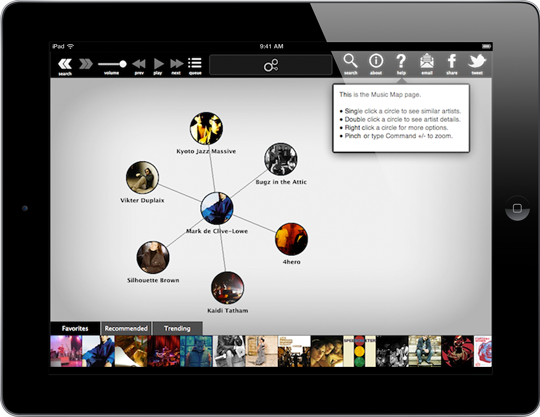
Result: The callouts worked well, and it’s something that we’ll continue to use. It’s particularly useful because we can display information that is relevant only for a particular screen. The callout approach also travels well when we add more screens or functions (the text can be changed directly in Xcode or on server side, rather than needing to design new graphics every time).
4. Baked In Help
In Discovr Music v2.0 we developed a whole new style of help that is baked into the interface itself: the map itself shows you which gestures you should try next. The first time you search for an artist you’ll see something like this:

You’ll see a bright red node with “Tap Me” overlaid on it, prompting you to try that gesture. If you do tap that red node, you’ll see the result of that gesture (which is to expand that artist node and show similar artists around it).
After that, the next gesture will appear and you’ll see a red “Double Tap” node. If you double tap that node you’ll see the result, which is to go to that Artist’s page.

Lastly, you’ll see a “Tap & Hold” node in red. If you Tap & Hold on the red node, you’ll see new functions like adding songs to your music queue, or playing similar artists.

Result: This baked-in help approach works really well. The red nodes are distinct from the normal interface, but they’re also a part of the app itself, making the relationship between gestures and functions clear. The other benefit is that we end up with a basic design language that a user can recognise and understand (if they see red in the UI they know it’s related to help).
We recently reached 3 million downloads of Discovr and this baked-in help style is used throughout to highlight our gestures and functions. Try it out on Mac or iOS and let us know what you think!
PS: None of us are designers, so if you’re a killer designer and you’d love to be involved in Discovr please get in touch.
—
Follow me on Twitter.